I’m not. But I thought it would make a good example.
Let’s imagine I was twenty years younger, and looking to buy a diamond. Being a twenty year old male means that I wouldn’t know the first thing about diamonds, so my first port of call to expand my mind would be to Google: “advice on buying a diamond”.
Let’s compare four of the results I see.
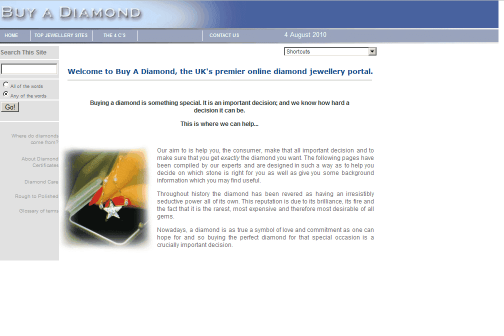
buyadiamond.net– little text, no information. Makes the classic mistake of describing what they’re going to explain without actually saying anything. Also quite an unattractive website – not the sort of place I would want to part with my money.
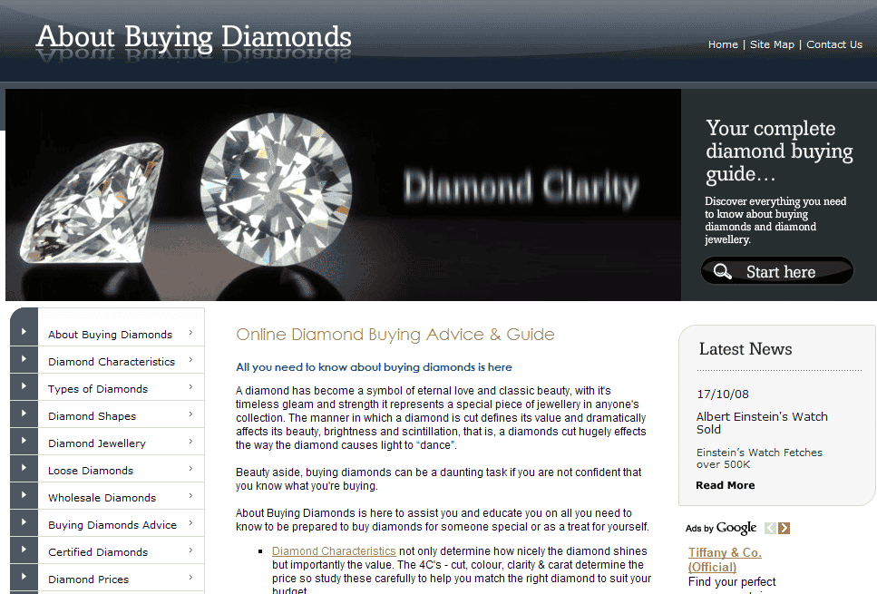
aboutbuyingdiamonds.com – appears to have a fair amount of information but leaves the novice a little unsure as to what to click on next or where to begin.
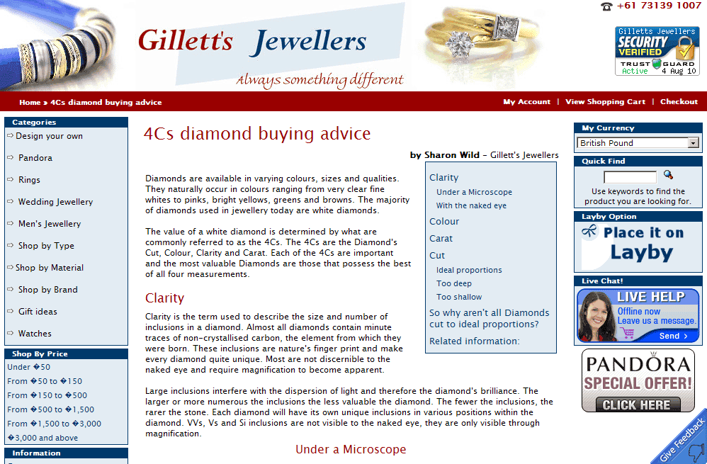
gillets.com – significantly better than the above examples. They start answering my question right from the outset, and the headline reassures me that I’m in the right place.
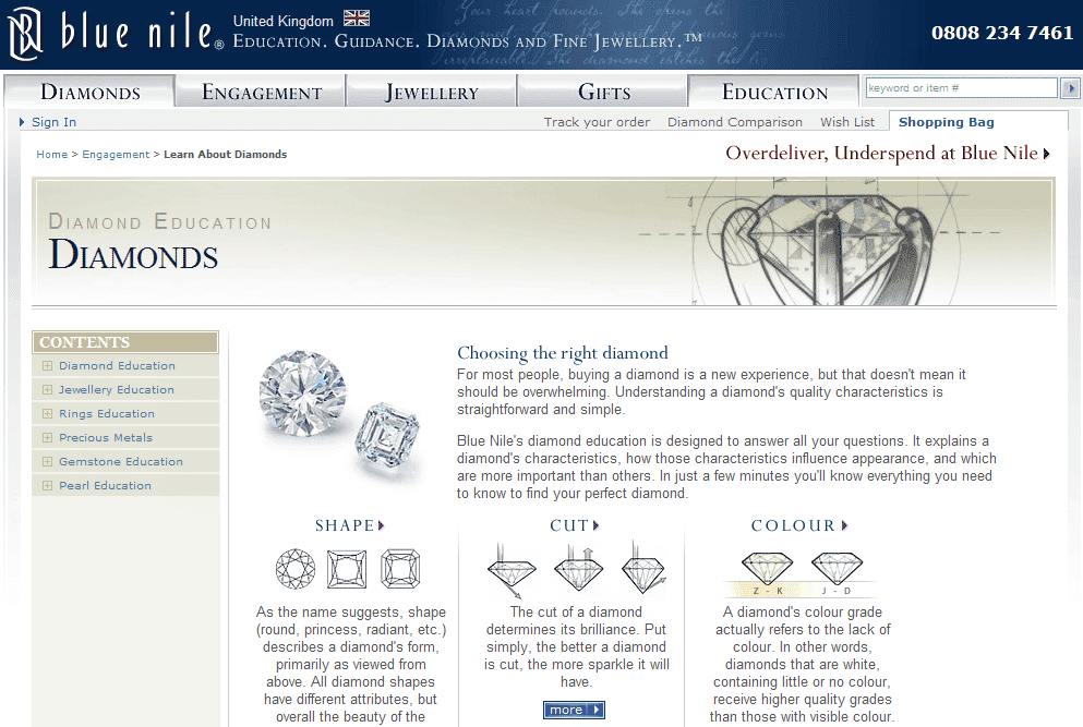
bluenile.co.uk – a cut above the rest. The most dominant aspect of the page is the information I need. The introductory paragraphs reassure me that I’m in the right place. Then there’s a short explanation of each characteristic, nicely illustrated, with a clear link to more information should I require it.
How you to choose to present your products or services on your website is critical to how well you sell them.
Next Wednesday I’ll be holding a 30 minute webinar that will show you 17 different ways to stop losing your website visitors.
17 different ways to increase your sales.
Register for the free webinar today.
Unique ideas for your business
The Demystifier puts practical ideas into your hands. You won't find them elsewhere. Original, actionable and insanely effective.


