I’m not a great fan of Amazon. But as much as I dislike their practices, I can’t stop using their services.
One of the things that I grudgingly admire is their website.
And considering the amount of money they make from all of us, I think it’s only fair to take a few of their ideas and use them on our own websites.
The screenshots below were taken from the Amazon UK website, just before Halloween, but are almost identical to what you’ll find anywhere else in the world.
I’ve grouped them in terms of the solutions they have to many common problems.
There are some excellent ideas that you can apply to your own website immediately.
Structure
Amazon’s problem:
Amazon sells a staggering number of items and services.
So how can they quickly and easily send people to the right place on their website?
Your version of Amazon’s problem:
You probably feel you have too much content.
All those brilliant product and service pages, your warm-hearted About page, insightful blog posts and more.
So how can you help your visitors find what they’re looking for, and also find what you want them to see?
Amazon’s approach:
When you arrive at their website, Amazon probably doesn’t know what you’re looking for.
So they approach the issue in terms of what might persuade you to stay.
Why? Because their main goal isn’t necessarily for you to buy what you’re looking for. It’s to get you to buy something, whatever that may be.
Look at the following screenshot, taken in an anonymous browser, not logged in, when I go to Amazon’s homepage:
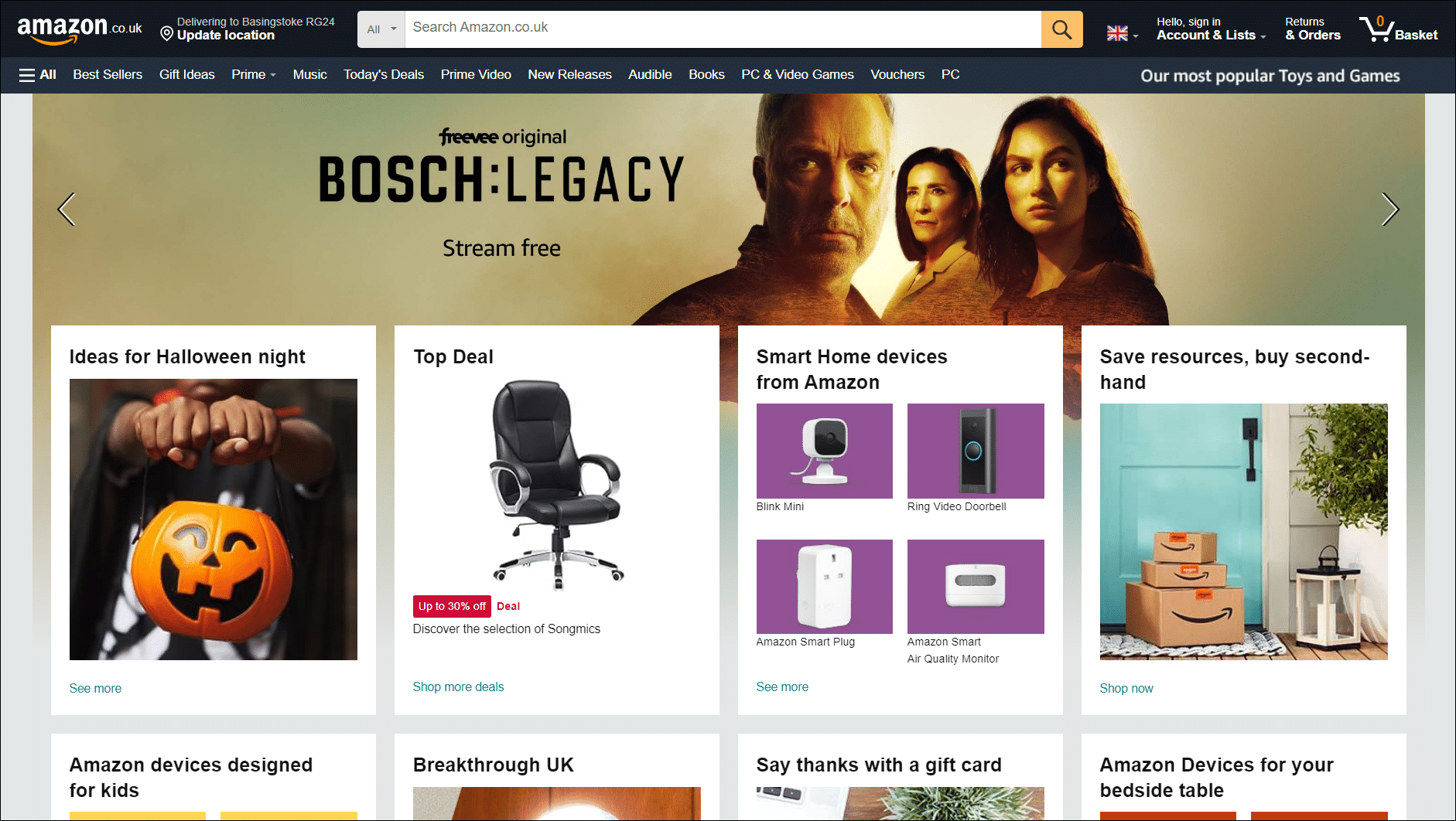
Amazon doesn’t have a clue why I’m here. But even without moving my mouse I can see streamed content, Halloween ideas, a deal on an office chair, smart home devices, the possibility of buying second hand and more.
And in case you never noticed, if I am looking for something specific, there’s an enormous search bar stretching almost the full width of the top of the page.
It’s probably the widest search bar that you’ve seen on any website.
How to apply this to your website:
You can’t link to every single thing from your front page, but you can prioritise what you want people to see, and what you believe they might be looking for.
Think of an entrance to a large shopping store.
If there’s a map, it won’t contain every single item in the store, but will instead have things grouped together in areas:
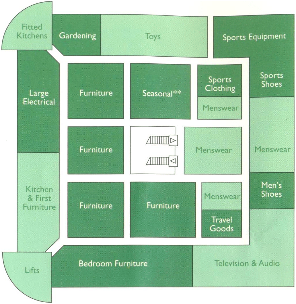
Once you get to the relevant area, there’ll be another means of helping you find what you’re looking for.
So where do you want your site visitors to go? And what do you think they may be looking for?
Unlike the physical map, you can always offer a search function if needed.
Bonus question:
Do you have any idea what brought them to your website in the first place?
If so, does your nav feed into, answer or address that?

The top nav
Amazon’s problem:
Amazon has a staggeringly high number of items on sale. The latest figure is thought to be around 12 million.
That’s probably more than you.
So if someone isn’t going to use the search, the next most likely option is the top navigation.
But how to choose what to put in it?
Amazon’s approach:
My guess is that these items will change around a lot over time.
But look at what there is from left to right:
![]()
BEST SELLERS is a fantastic bit of psychology. It taps into the fear of missing out, and also raises a little bit of curiosity.
Additionally, if many people are buying these items, then they must be great products and deals, right?
Then we have GIFT IDEAS. Again, this is deceptively clever. Because even if the visitor isn’t there for a gift at that moment, at some point they definitely will be.
So it’s a nice reminder that Amazon is a great place to go for gifts.
The other items are ingenious too.
PRIME is of course a massive money-maker for Amazon, as in a sense, we pay for the privilege of always going to Amazon first to spend our money.
MUSIC and PRIME VIDEO are simple enough, and TODAY’S DEALS again taps into the very common urge to buy something if the price is (or appears to be) great; whether or not we actually want or need it.
And labelling it with TODAY implies urgency. This deal may be gone in literally a few minutes. Aren’t you at least tempted to see what it is?
Another interesting fact is that even on my fairly high-resolution monitor, when I extended the window onto another monitor, more items appeared.
In fact, I saw a staggering 29 individual links. And the last one was Customer Service! Draw your own conclusions there.

Amazon has far more data than most businesses can even dream of.
So they’re in the position of being able to measure the effects of every single tweak or experiment to see what works, and relentlessly improve it.
But in terms of their top navigation, each link shares at least one out of two criteria:
1 – Amazon thinks their customers want to go there
2 – Amazon wants their customers to go there
Keep in mind that to all intents and purposes, the top nav is the prime real estate of the browser window.
Compare that with the bottom nav, where I counted an incredible 72 items!
How to apply this to your own website:
Look at your top nav with objective eyes, and ask yourself:
1 – Is the order of the links really what you want or need them to be?
You need to strike a balance between what your visitor may be looking for and what you want them to see.
But are you striking that balance correctly?
2 – Is the wording effective? Or does it blend in with the billion screams of boredom and conformity from the rest of the web?
I’m not suggesting that you go overboard to demonstrate your wackiness to the point of confusion.
But there may be other possibilities than Home | Services | About | Blog | Buy
3 – Is every item in the top nav strictly necessary?
I’m a great believer in the idea that the more options you give someone, the less likely they are to do what you want them to do.
I’m not suggesting that’s why Amazon put Customer Service at the very end of their looooong top nav.
Okay. I am saying exactly that.
At the time of my sketching out this post, this is what our own website top nav looked like:

And in the interest of brutal honesty, I think it’s quite poor.
In other words, I’m the equivalent of the dentist with very brown and rotten teeth.
And food between my teeth.
Why?
WHAT WE DO – I like this a lot more than [HOME], but look at what’s on the page:
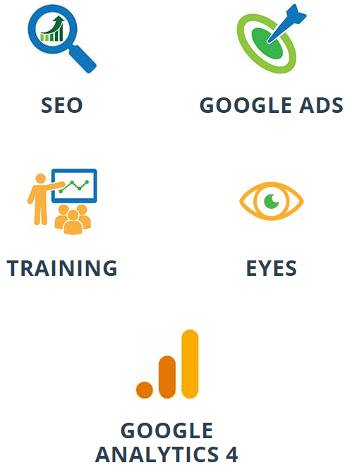
Yes, we “do” these things, but why would anyone care?
Surely, they’d be more interested in knowing what we can do for them. SEO and Google Ads are just tools to achieve that.
WHO WE ARE – years ago I realised the importance of our [ABOUT] page, as not only does it reassure visitors, but people like people.
So while I like the theoretical idea of what we’re doing, the existing approach needs freshening up.
WHO WE WORK WITH – a nicer title than [OUR CLIENTS], but again, clicking the link and seeing the page made me want to freshen it up.
BLOG – I’m not sure about this one. I’m not sure about something like WHAT WE THINK or IDEAS FOR FREE, but maybe that would work? If you have any ideas, I’m all ears.
Bonus question:
Once you finalise your choices for the wording of each link, does the destination do what you want it to do, and what your visitors want it to do?
Shoplifting without risk
If you’re only going to take one idea from this post, then consider this:
Looking at your website with fresh eyes can be an effective way to make your website perform better.
You work hard at drawing people in, so shouldn’t it be more efficient?
Or maybe use our Fresh Set of Eyes for only $99.
And if you want to take a second idea from this post, then look at Amazon’s website through the eyes of persuasive copy. It’s irritatingly well done.
Unique ideas for your business
The Demystifier puts practical ideas into your hands. You won't find them elsewhere. Original, actionable and insanely effective.