I assume that by now, you’ve at least looked at your Google Analytics 4 account. If you found it a little overwhelming, you’re not alone.
And if you mentally filed it under the “get my head around it one day, but not today” category, then I certainly feel your pain.
So putting aside my own dislike of the new platform, I thought it might be useful to share a few basic and simple starting points.
No complexity, stress or teeth grinding required.
There’s nothing fancy here, but this could be helpful for you to find some of the information that you might be missing right now.
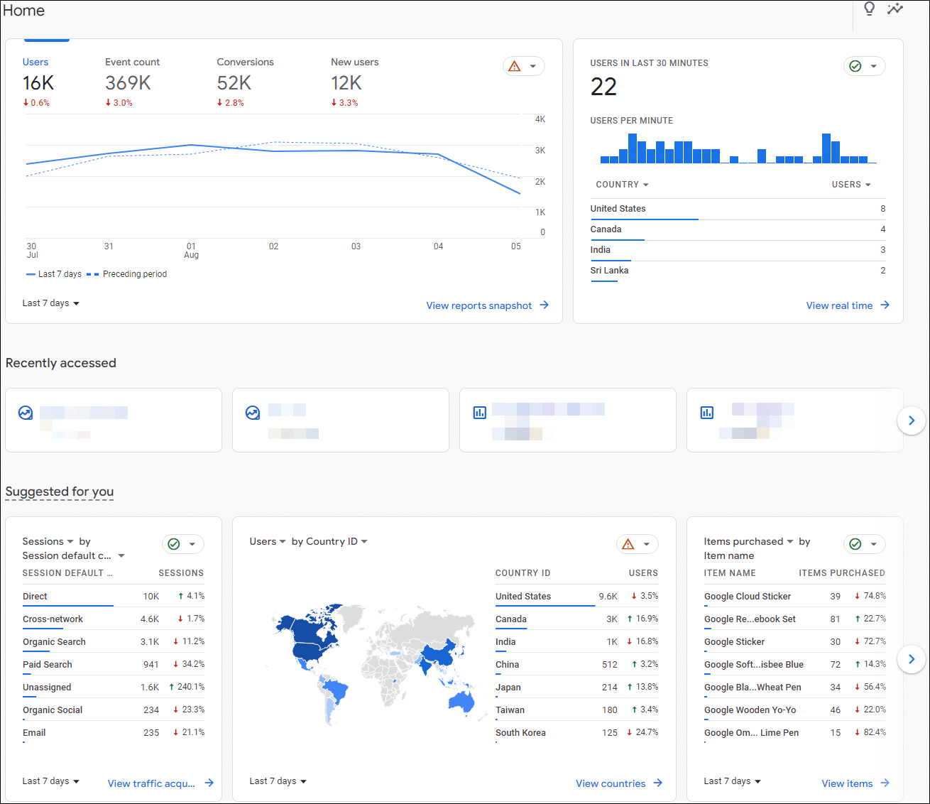
When you open your GA4 account, you’ll probably see something that looks similar to this:
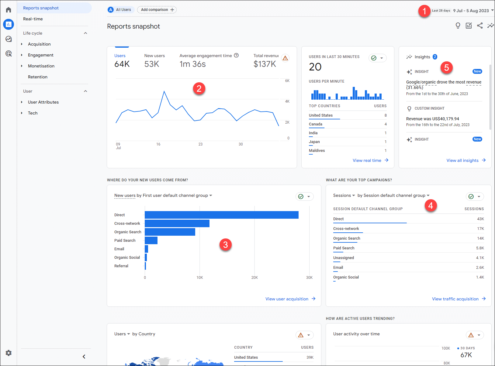
A good starting point is to click the “View reports snapshot” link under the first line chart, taking you to this:
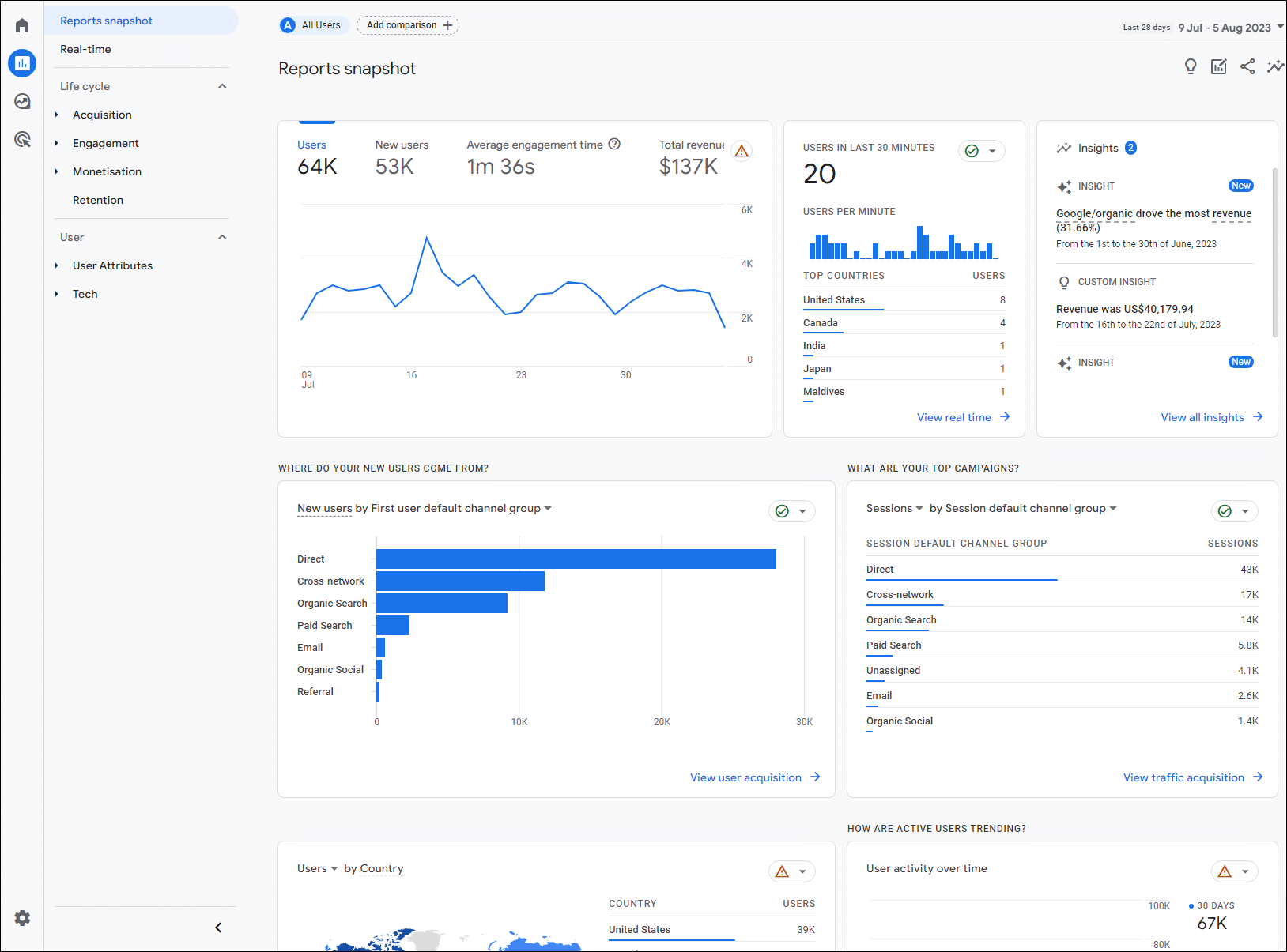
A few important points here.
1 – date. By default this is set as the last 28 days. This is far better than the old 30 days option, as 28 covers exactly four weeks, so will give you a cleaner insight into the patterns and trends.
2 – 28 day line chart. By clicking on the heading at the top, you can choose to display either users, new users, average engagement time per active user, and the total revenue.
The basic (simplified) difference between users and new user? If a person comes to your website today, then comes back in a weeks time, GA4 should count these as two users, but one new user.
3 – where your new users come from? Reasonably self explanatory and useful, but note that this only shows the quantity of new users from each source, and not the quality.
To dig deeper here, click on the “View user acquisition” link, where you’ll see something like this:

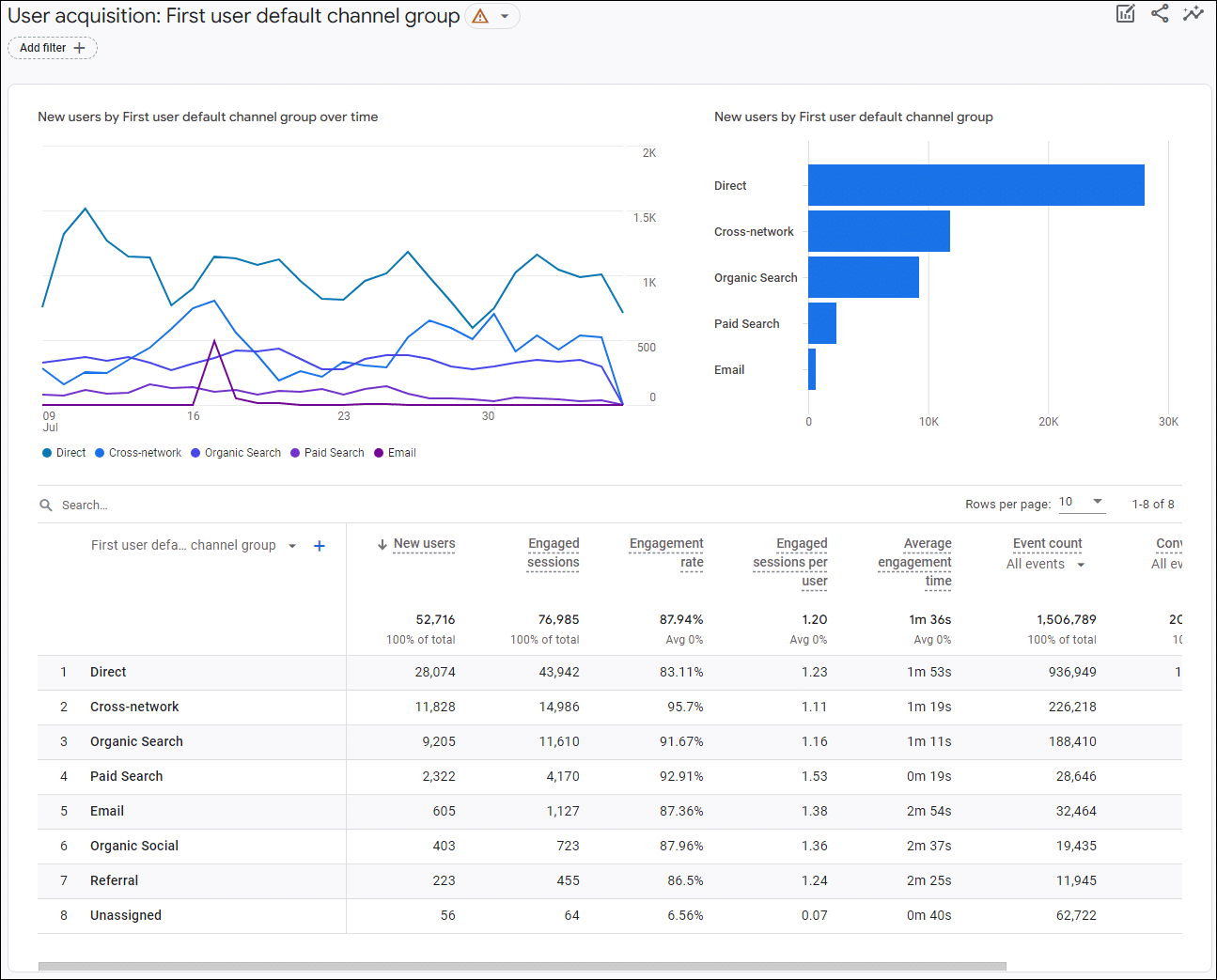
This gives you more quality indicators, and if you hover over any of the column heads with dotted underlines, a useful popup will explain what each of the term means.
At this point, it’s a good idea to understand what you’re seeing here, in terms of Google’s terminology.
Don’t Panic. It’s not as confusing as it may seem.
This chart is showing you the “new users by first user default channel group over time“.
This is far from normal language, so let’s break it down.
New users – we’re already clear on.
A channel is simply a collection of source definitions. For example Google Organic, Bing Organic and Baidu Organic would fall under the channel of Organic Search.
So first user default channel is simply the channel by which users first arrived at your website.
4 – session by session default channel group. This is the default channel group that referred the user’s session. And you can also change Sessions to Engaged Sessions, which basically means sessions that lasted longer than 10 seconds, had two or more page views or a conversion event. In other words interested users, as opposed to people who immediately leave the website.
5 – insights. This is where Google try to draw your attention to anything that they feel has significantly changed. And again, clicking the “View all insights” link will take you to other items of interest. Or not.
Now that you’re hopefully feeling a little clearer, let’s take a quick look at some of the other useful default reports in your account.
Hovering your mouse over the four icons in the top left corner, will open them up to something like this:
![]()
And if you click on reports, you should see something like this:
Note that this could look quite different, according to how you’ve customised it.
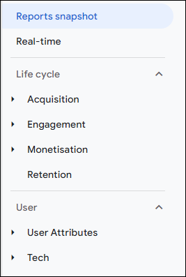
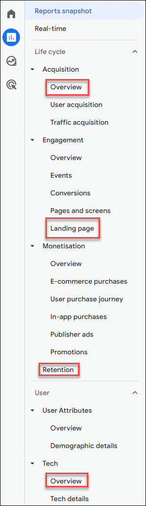
If you go to Life Cycle > Engagement > Landing Page, you’ll see something like this:
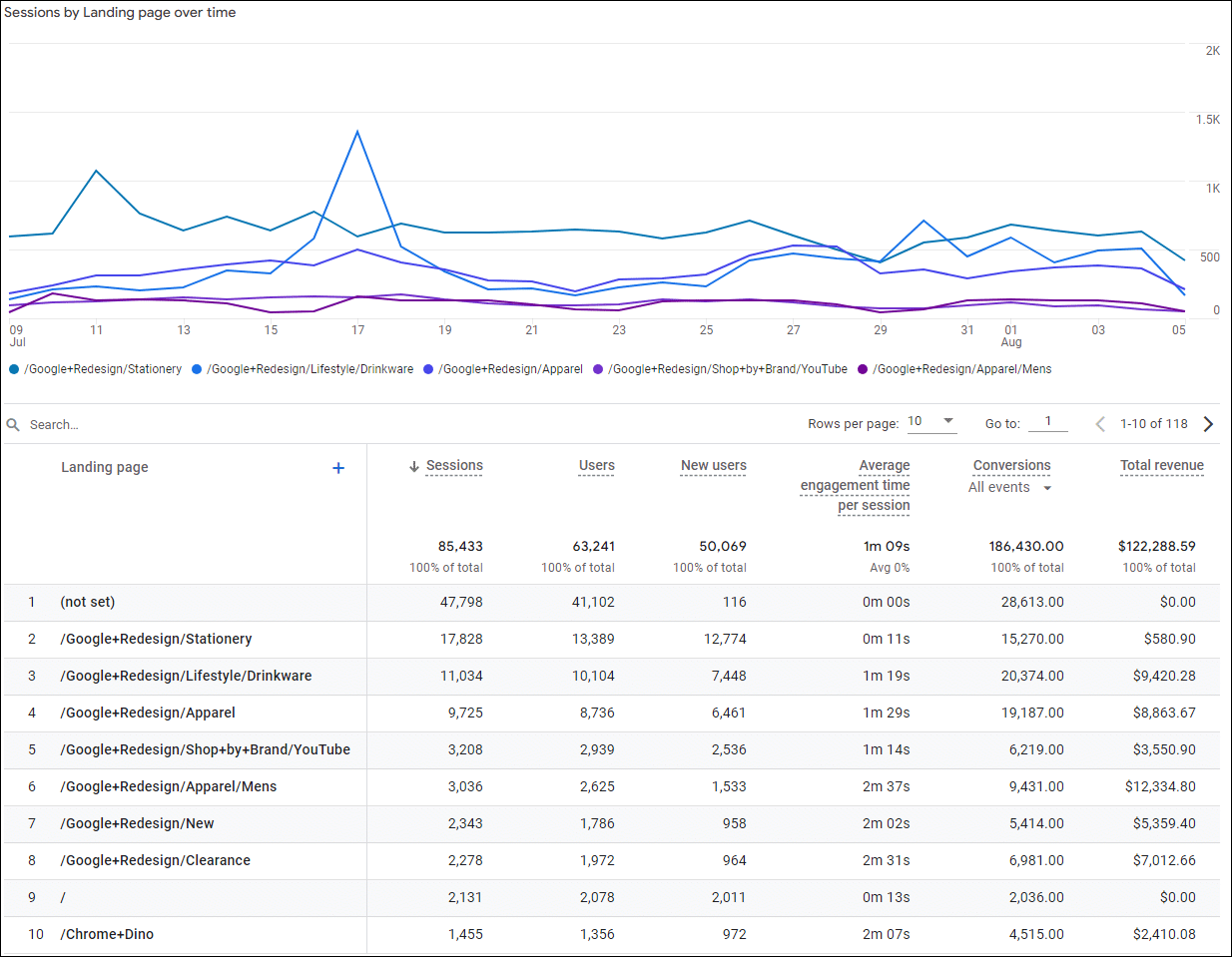
Again, don’t let the confusing labels at the top of each column confuse you. This is just Google reminding you how clever they are.
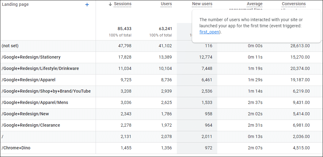
Hover over each of the terms for a clear explanation:
So for each of the top landing pages, you can see the number of users who arrived there, the average engagement time per session and more.
In the above screenshot, for example, we can see that the eighth listed page seems to engage users far more than the second. This is important, useful and actionable information.
At this point, it’s a good idea to play around a little. You can’t break the default reports by experimenting, so it’s time well spent.
For instance the top right three icons:
![]()
The first will let you customise what you’re seeing, and is reasonably easy to tinker with. The second lets you share a report, and the third, insights, gives you an easy way to dig up some potentially useful information.
Exploring any of the items under reports is a good way to dip your toes into GA4 without risking drowning in the data!
Go forth and explore!
Unique ideas for your business
The Demystifier puts practical ideas into your hands. You won't find them elsewhere. Original, actionable and insanely effective.