When’s the last time you tweaked your website’s main pages?
Not a complete redesign. You don’t have time for that.
But what if I told you that your website is almost certainly making at least two out of three common mistakes?
And that these mistakes are easy to fix. Generally in literally a few minutes.
And what if they had a measurable impact on whatever you choose to focus on?
You know, the old-fashioned stuff, like actual sales?
Here are three of the most common mistakes that your website is probably making.
You assume I’m going to read your content
When I arrive at your website, I’m not going to make a hot drink and work my way through all your content.
Sorry. It doesn’t work like that.
There are various theories and studies to back this up, but the common theme is that people just skim online content.
In fact you’re probably skimming right now.
But you’ll notice that eyes are drawn to text that stands out.

And images.
Images are superb at drawing in attention. Fleetingly. And different colours are good too.
In fact, any sort of text that stands out.
Especially in terms of size.
The point is that your impatient visitor won’t put much effort into understanding what you’re about.
Ultimately, they’re on your website for themselves; not for you.
And if they came from Google, the moment they don’t see what they’re looking for, they’ll leave.
And go straight back to Google to look at your competition.
Let’s take a look at how that might work.
I carried out a search for [emergency plumber in London].
Unsurprisingly, the top organic results do a reasonably good job of communicating that they have what you’re looking for.
For example:
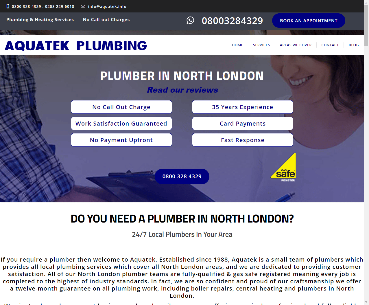
That website isn’t going to win any design awards. But look at what you see there:
- reassurance: what you are looking for is here
- reassurance: reasonable charges and satisfaction guaranteed
- reassurance: safety
- reassurance: experienced and trustworthy
- reassurance: available right now
That’s pretty good, in my opinion. And look at the top half of the page – it’s all easily skimmable.
Now compare it to something like this:
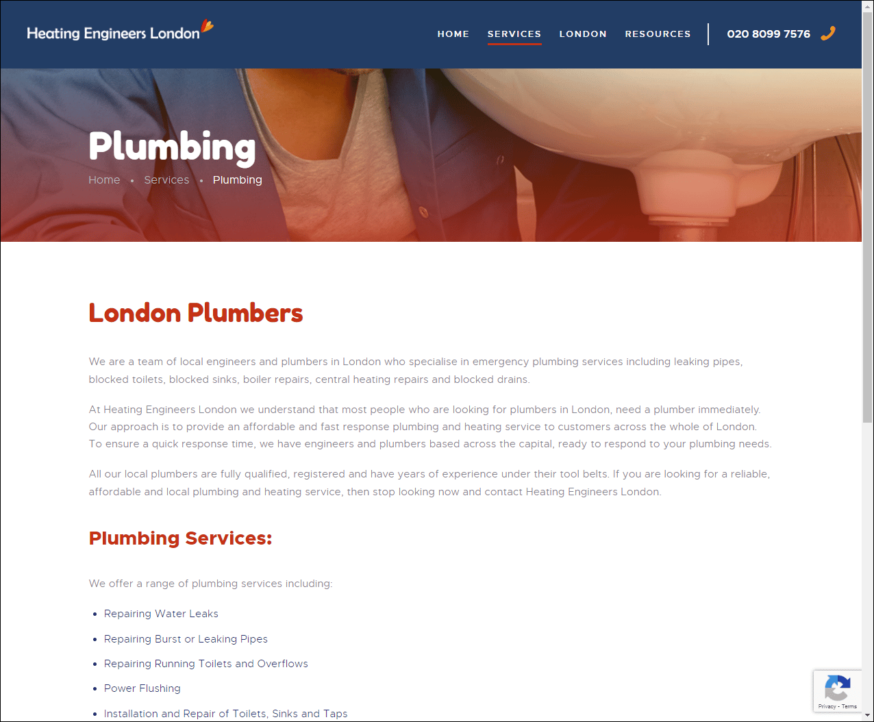

It’s not the worst website I’ve seen, but the main thing I notice is three variations of the word plumber.
And aside from a hint of a beard but no chest hair, nothing else jumps out at me.
Try to look at your main website pages with a completely fresh eye.
Or use my far-from-fresh but experienced eyes to see what your website is missing out on.
But for now, what jumps out at you?
And is this what you think your visitor will be looking for?
Don’t look for things to add. Look for things to remove.
Does the headline jump out? Is every word essential?
Is it compelling?
Is there a clear call to action?
What’s the main thing you’d like your visitors to do?
Can they do it easily?
What can you remove to make it clearer?
You assume I know who you are
A hard truth is that none of your site visitors care about your logo.
Not even your parents. Look them in the eye and ask them.
None of your visitors care about your awards and qualifications either, aside from a few exceptions.
No matter how important and relevant you think they are.
For example, did you happen to notice that we’re a Google Partner?
It’s at the bottom of every page on our website:
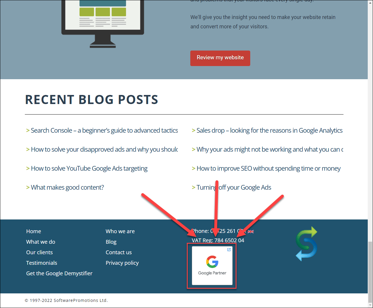
How did you miss it?
Because you don’t care.
But if someone was thinking about working with your company, there are a few things they might care about.
How many years have you been in business?
Where in the world are you located?
Are you one person or a team?
Any testimonials from someone I might know?
Any social proof?
Are you dead, or still in business?
How human are you?
Some time ago, we moved the link to our about us page from the far right-hand side to the second from the left.
Not the most dramatic of changes, but it worked.
We get more clicks and a higher engagement rate.
Why? Because people like people.
Even when they’re shy and introverted, they still like working with people.
Even if only through a screen and no closer than 150 miles.
People care about people.
And if you show your carbon-based-lifeform side in the emotionless desert of the web, it adds a little hint of humanity.
And reassurance.
You say too much – far, far, far, far too much
On a website, the number of words you use to make a point is inversely proportional to the message clarity.
I’m quite proud of that.
Less is better.
As we know, people don’t read your website content. They skim it.
And not very thoroughly.
You probably know the concept of the elevator pitch? From the times before COVID?
— cough —
Your website doesn’t have that luxury of 30-40 seconds.
At least not on first contact.
You literally have seconds to answer a hierarchy of questions:
- Do you have what I’m looking for?
- Can I easily get it from you?
- Can I trust you?
- How do I start the process?
Anything that gets in the way of these things risks losing that visitor.
- Mission statements (no-one cares, again, not even your parents)
- Company news
- Too many words
- Images that serve no purpose
- Too many choices, options and decisions
- Repeating the same thing in case they missed them the first time
- Complexitisation
- Made-up words
- Poor usability
- Repeating the same thing in case they missed them the first time
- Anything that annoys them
We’re so used to seeing our own websites, so tend to see them as we want them to be seen.
Or think that they are seen.
But your typical site visitor has a different experience, with their fresh set of eyes.
Right now, you can use my fresh set of eyes on your website from as little as $99.
What do you have to lose?
Aside from $99.
Unique ideas for your business
The Demystifier puts practical ideas into your hands. You won't find them elsewhere. Original, actionable and insanely effective.