Google Analytics makes it easy to make bad decisions. Really bad decisions.
There’s nothing wrong with Analytics as such, aside from some poor design decisions. But it’s a power tool.
But unlike many power tools, it doesn’t come with a bright warning sticker, and there are no gleaming blades and loud noises to tap into our common sense and scare us.
In the wrong hands, Analytics is dangerous. And most of the hands using it are indeed the wrong hands.
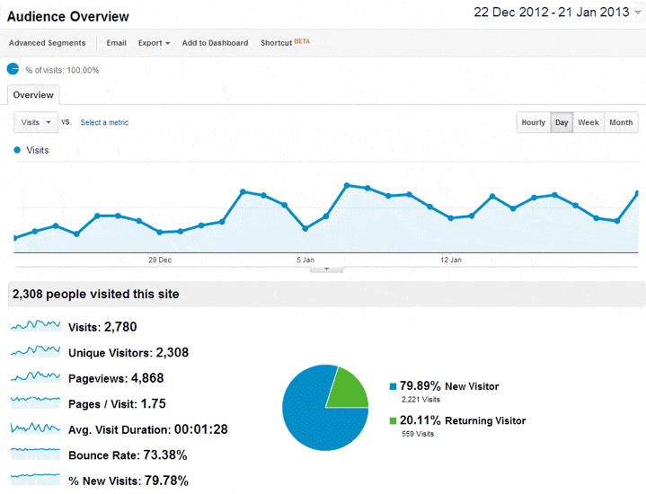
Log into your Analytics account, and the first thing you see looks something like this:

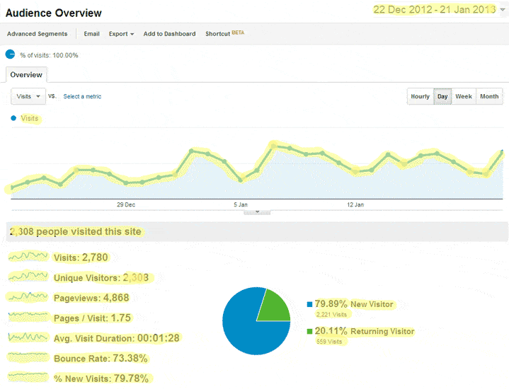
If you look closely, you’ll see that most of that information is more or less meaningless.
To make life easier, I’ve highlighted the information that serves no real purpose:
Most of it is technically correct, but easily/usually misunderstood. And misunderstood information becomes dangerous when acted upon.
Basic big mistakes.
Number of visitors:
Meaningless.
If your website goes from 50 to 500 visitors a day, who cares?
What if the original visitors were targeted and interested in what you sell, while the new visitors were interested in a blog post, but didn’t go beyond that single page?
Would you rather have low volumes of targeted traffic or high volumes of visitors who couldn’t care less about your products?
It’s obvious, right? But this is the first thing you see in your Analytics account.
Page views.
Meaningless.
In theory it’s a good indicator of quality: the more pages people view the more interested they may be.
But this is averaged out, even though Google don’t remind you of this.
Consider the above example of your website getting 50 visitors a day, and they view an average of five pages. That’s quite good.
But the additional 450 visitors only view one page before leaving.
So the average now falls to 1.4 pages.
But what does that mean? That all the visitors are only viewing just over one page of content?
Intermediate big mistakes.
Bounce rates.
Meaningless.
The above scenario saw an influx of an additional 450 visitors a day who went no further than the blog post.
Some might never again have any contact with you. Others may remember your website and products in the future. Others may follow you on social media channels.
One, as happened to our company, might become one of your biggest clients of all time.
Pages per visit.
Meaningless.
See above.
New vs. returning.
Meaningless.
Even ignoring the technical potholes that may affect the accuracy of this information, what does it actually mean?
If your website does a great job of selling your products, a significant number of visitors may buy on their first visit. Never to return.
But some good publicity will result in a surge of new visitors.
Both scenarios can skew the data.
It’s neither good nor bad if your return visitor count is high. It depends on the goals of your website, and where your visitors come from.
Advanced big mistakes.
Poor sampling.
When comparing data from two different time periods, always make sure that you’re comparing like with like. Don’t let the Analytics confuse you.
Logging into an Analytics account at the time of writing this shows me the following 31-day date range by default:
If I then choose to compare to the default previous period, the following dates will be selected.
The problem is that the latter date range includes five weekends; the earlier period only four.
Yet your website sees different trends during weekdays and weekends.
More poor sampling.
The above example included Christmas and New Year, a time that most websites will see a drop in activity on their website.
Compare January with December and you’ll see most “metrics” improve – but again, this is meaningless.
Another common mistake is to look at too small a data sample. For example trying to gauge the success of a page on your website looking at a five day sample with only 25 visitors in total.
Sticking to time intervals of seven days is safer, as is looking at reasonable volumes of data.
Mobile visitors have poor “metrics”, therefore mobile visitors aren’t worth investing in.
You can already see where this is going, but I heard two variations of this identical argument last month alone.
Mobile visitors are never going to engage with your website if what they see on their device looks crappy.
So where does all of this leave us?
Analytics is great – in the past our company paid a lot of money for tools that didn’t even come close to what we now get for free.
But Analytics is very easy to misread.
Five tips to keep you on track:
1 – Understand Google’s terminology and learn to correctly read what you’re looking at.
2 – Go into your Analytics account with a specific purpose. “Just checking what’s happening” will only lead to wasted time.
3 – Setup dashboards to make life (much) easier.
4 – Embrace your inner-cynic. Imagine the data is telling a story you don’t agree with. Pick flaws.
5 – Embrace your inner-cynic. Imagine the data is telling a story you don’t agree with. Pick flaws. (It’s worth saying twice)
Unique ideas for your business
The Demystifier puts practical ideas into your hands. You won't find them elsewhere. Original, actionable and insanely effective.


