The new CNN website is scheduled to go live next Monday, and a TechCrunch article gives us some details and screenshots of what’s to come.
The New CNN.com (First Screenshots)
I don’t really visit CNN for news, but have always found the similarities (and differences) between their main navigation and that of the BBC News website oddly interesting.
CNN’s is horizontal and sleek:
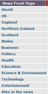
While the BBC’s is vertical and more populated:
Interestingly, both begin by focusing on regions. Yet the BBC places World as the top priority, while CNN place this category in fourth place. And while the CNN nav includes Asia, the BBC has Health. Draw your own conclusions.
The article shows a slightly unclear screenshot of the new CNN, but it does appear that the new nav has an intriguing link to Justice.
As for why they’re changing the design:
“…there are two reasons to change CNN.com: the site wants to constantly move forward, and it wants to help expose the wealth of content that exists beyond what sits on the homepage.“
The first is just corporate babble, but the second is more familiar territory. Bizarrely it’s a problem that almost all websites face, yet everyone thinks of it as a unique problem:
New content develops, the website expands. How do you show your visitors everything that you have?
The short answer is that you can’t. A map inside a large store doesn’t show every item available for purchase. It groups items into categories, lays them out logically, and places clear, prominent navigational aids all over the store for shoppers to find what they’re looking for. Within each area, products are presented by popularity and margins. It’s that simple.
Websites can learn a lot from the big stores. A brightly lit and clean entrance (home page) offers clear directions (navigation) to the different sections of the store (content). Clear signs throughout (navigation and links) help the visitors, and there is extensive highlighting of special offers and discounts, with best selling products often being on display to draw extra attention. Checkouts are easy to find and use (shopping carts), and while waiting, shoppers are bombarded with impulse buys (upgrades and upsells); and they work. Convenient and free parking (shipping or instant download) sometimes makes the difference between the shopper visiting that particular store or going elsewhere.
You get the idea.
Next time you’re in a large store, open your eyes to how they’re setup, and try to take away more than just your groceries.
Unique ideas for your business
The Demystifier puts practical ideas into your hands. You won't find them elsewhere. Original, actionable and insanely effective.


