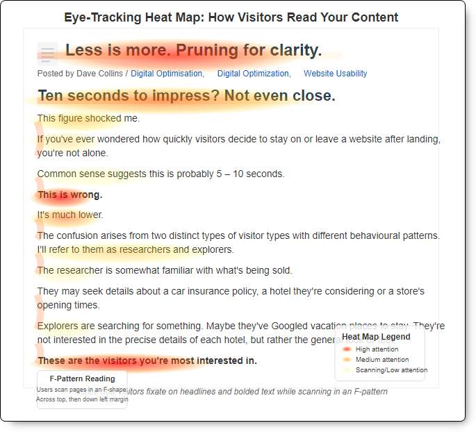
Ten seconds to impress? Not even close.
This figure shocked me.
If you’ve ever wondered how quickly visitors decide to stay on or leave a website after landing, you’re not alone.
Common sense suggests this is probably 5 – 10 seconds.
This is wrong.
It’s much lower.
The confusion arises from two distinct types of visitor types with different behavioural patterns. I’ll refer to them as researchers and explorers.
The researcher is somewhat familiar with what’s being sold.
They may seek details about a car insurance policy, a hotel they’re considering or a store’s opening times.
Explorers are searching for something. Maybe they’ve Googled vacation places to stay. They’re not interested in the precise details of each hotel, but rather the general look or feel.
These are the visitors you’re most interested in.
They’re quickly deciding whether to stay and research, or return to Google.
If they stay, they might buy. If they leave, they’ll probably leave for good.
Explorers don’t want to permanently search for what they need.
When they find it, the journey will be over.
Almost 90% of online consumers won’t return to a website after a bad experience.
The brutal reality is that these visitors won’t spend a minute or even ten seconds deciding.
They’ll decide in three seconds or less.
Research suggests that users take “half a second for a user to make judgments about a site’s visual appeal.”
Half a second.
Here’s the takeaway.
If your website overloads or confuses visitors, this is costing you customers and sales.
How to apply this.
Look at your website with fresh eyes, or have us do it for you.
Be honest.
Would you say it’s clean?
Clear?
Cluttered?
Really?
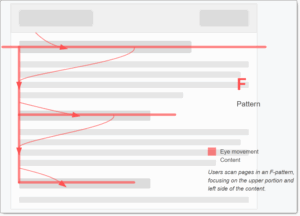
No one reads; they only scan.
Consider how you read a physical book or a newspaper article.
Assuming your chosen language is written left to right, you mostly read the text from left to right. Then, you jump to the left side of the next line.
In theory.
But when it comes to websites, people behave quite differently.
The first difference is that instead of reading every word, people generally scan in an F-pattern.
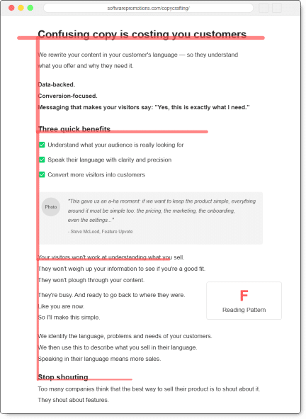
It works.
Bounce and exit rates reinforce this.
The second difference is that visual information is processed much faster than text.
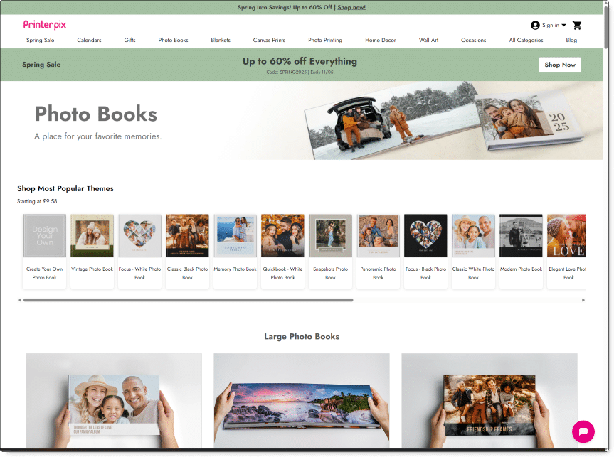
Consider a person seeking a service to print their digital photographs.
After searching for these on Google, I clicked on a few ads I saw.
Printerpix:
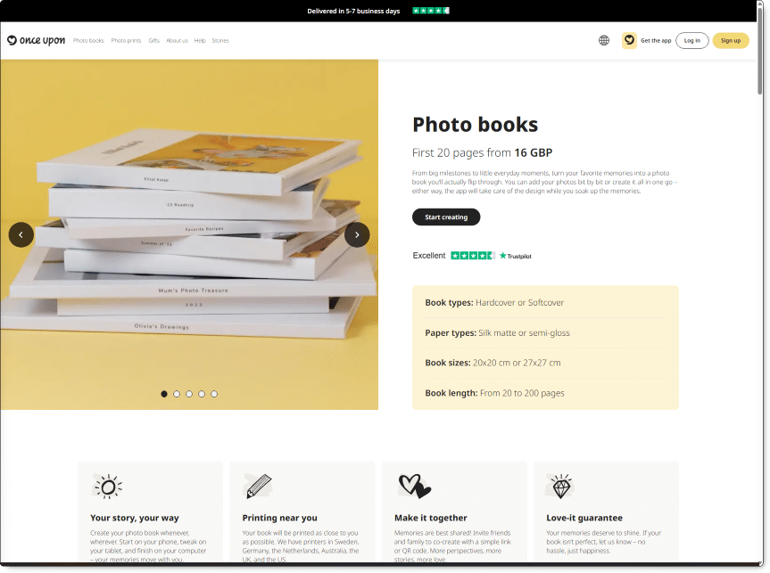
OnceUpon:
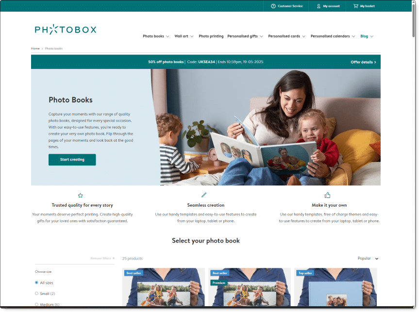
PhotoBox:
The first one is overwhelming with choices and sizes.
The second is better, but it still makes me realise I’ll have to make some decisions. Work will be required.
The third option shows how great a book would look and tells me what to do next. One button. Start creating.
I know similar decisions will be ahead of me, but for now, the resistance to starting is almost zero.
The Cognitive Load Problem is real for websites.
If it’s hard, your visitors won’t persevere. They’ll leave.
Your explorers will move to the next place on their map.
Keep it simple to help your visitor understand your offerings within three seconds.
How to apply this.
Look at your website objectively.
Is the text scannable?
What steps could you take to improve this?
Hick’s Law and the Paradox of Choice.
I’m going to be honest.
I only recently discovered Hick’s Law.
But it made me happy.
There’s nothing like a law to reinforce what you already believed!
Hick’s Law (or the Hick-Hyman Law) states that the more choices a person is presented with, the longer the person will take to reach a decision.
Consider a restaurant menu. Choosing a dish from a five-choice starter menu is infinitely easier than choosing from over fifty.
From your website’s perspective, more options for a visitor decrease the likelihood of them doing what you want.
Consider the software company Acronis.
They sell software to create images of your hard drive.
If your hard drive becomes corrupted, catches fire, gets infected with malware or breaks, they’ll quickly have your system up and running again.
It’s that simple.
But their website doesn’t reflect this.
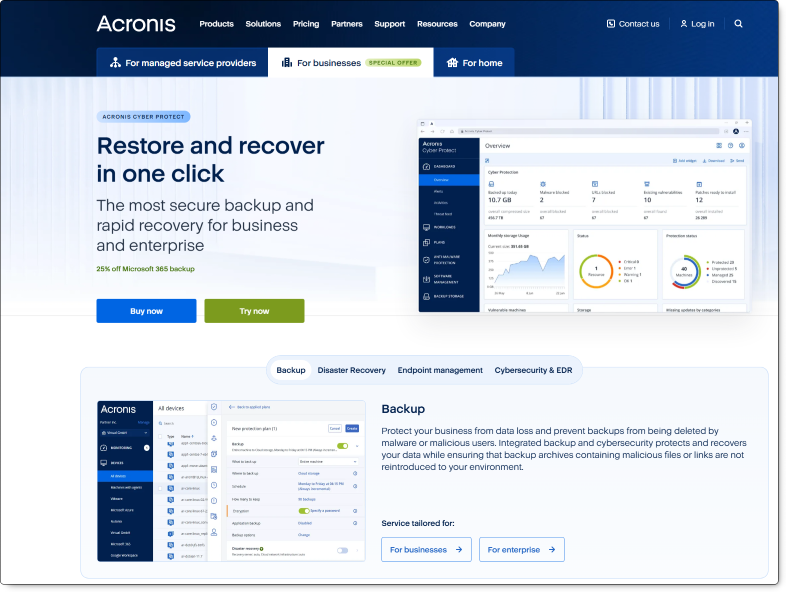
Three different tabs at the top.
11 items in the top navigation.
“Natively integrated cyber protection”?
“Natively integrated cybersecurity, data protection, and endpoint management for MSPs”?
Get 1:1 demo?
Too many options.
Too many choices.
Too many questions.
How to overload your visitors.
- Too much information
- Not enough space
- Visual clutter
- Vague options
- Too many links
- Too many buttons
How to apply this.
Is your website presenting too many choices? Can anything be pruned?
Navigation Nightmares.
The purpose of a website’s navigation is to help visitors find what they need.
You probably wouldn’t want to take up space pointing to individual blog posts.
Ideally, you want your visitors to do a few things.
For example, click on your main product page, download a trial, schedule a call, etc.
The key principles are
- keep it simple
- keep the options brief
- don’t hide it
- avoid being clever
Keep it simple:
The mantra of less is better still applies here.
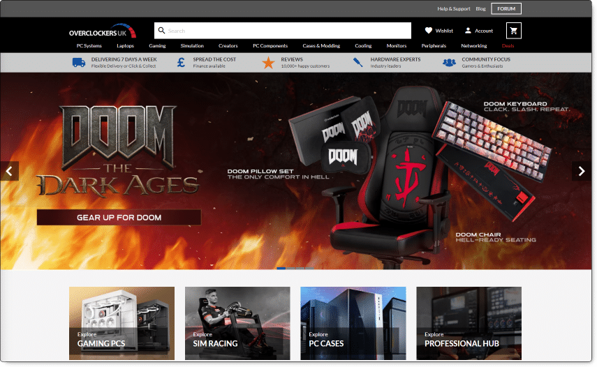
Scan Computers in the UK sell many products, yet their top navigation is brief:

Similar to grocery store aisle signs, clever grouping makes finding what you need simple.
Keep it brief:
Overclockers UK, on the other hand, fail to keep it brief.
With 12 items in one line of their navigation:
Don’t hide it:
The Hamburger Menu shows a hidden or collapsible navigation menu.
It’s mainly for mobile websites.
For reasons I don’t understand, some websites are now using it to hide their navigation on desktop devices.
I’m a big fan of AnyType, but their use of a hamburger menu to hide navigation means it’s hidden.
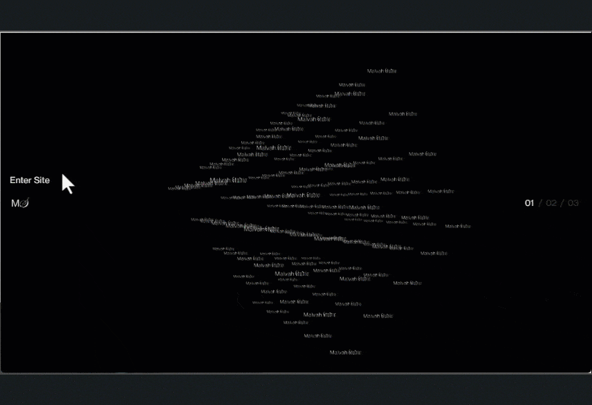
Avoid being clever:
Malvah Studios.
Enough said.
Whether your visitor is an explorer or a researcher, they will appreciate clear navigation.
How to apply this.
How many items are in your top nav? Which can be removed? Be ruthless.
The White Space Paradox.
Unlike common practice, emptiness and white space in design are valuable.
In a group discussion, you know the laconic principle: the less someone says, the stronger and more confident they appear, and the more people listen.
The same principle applies to the communication of your web pages.
Less is more.
Fewer words make a stronger, clearer, and easier message to understand.
Example 1: Single block of text
Example 2: Broken up
I could link to various websites. Instead, I’ll show you an actual example.
What you’re reading right now.
Having such a solid block of text means that nothing jumps out.
There’s nothing for the skimmer to fix on, it’s just a solid and relatively impenetrable wall of text.
Quantity drowns out clarity, every single time.
It’s like listening to a monotonous, non-stop stream of information.
It just doesn’t work.
Example 3: Broken up with highlighting
Using a little bold to highlight the main points too.I could link to various websites.
Instead, I’ll show you an actual example.
What you’re reading right now.
Having such a solid block of text means that nothing jumps out.
There’s nothing for the skimmer to latch on to, it’s just a solid and relatively impenetrable wall of text.
Quantity drowns out clarity, every single time.
It’s like listening to a monotonous, non-stop stream of information.
It just doesn’t work.
Icon confusion.
Most website templates come with variations of a look, dummy Lorem Ipsum text, and icons.
The icons are just for ideas, like Loren Ipsum.
Too many websites use them instead of discarding them.
By choosing the closest fit.
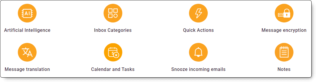
When used correctly, they can be vaguely useful:
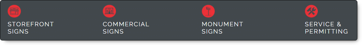
But often they’re like square pegs in round holes:
Don’t assume the icons only add a splash of colour.
Generic icons add to the clutter.
They add to the noise, overwhelm, and cognitive overload.
Customised icons aid communication. You can get some made for your needs from Fiverr for very little.
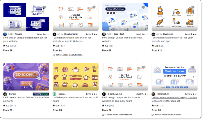
How to apply this.
Go to Fiverr today and order custom icons. Tell them what each should communicate, and show them your website for colour reference.
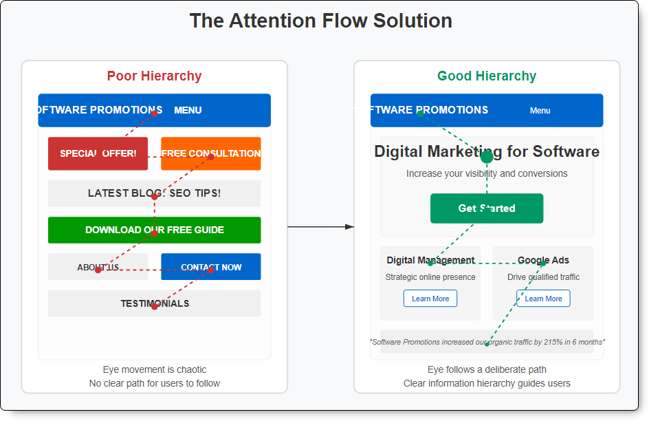
The Visual Hierarchy Crisis.
Many websites create problems by emphasising too much, sometimes by emphasising everything.
Visual hierarchy is about arranging the elements on a page according to their importance.
When the hierarchy breaks down, and we effectively get too many elements competing for attention, the result isn’t good.
Nothing stands out. You lose control of your visitor’s attention.
The solution is simple: keep your design simple.
- Decide what you want your visitor to see and do
- Limit these focal points to 1-2 elements per section
- Create a deliberate “visual journey” for visitors to follow
Consider two very different websites.
Apple:
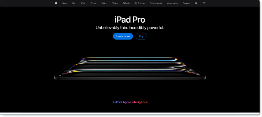
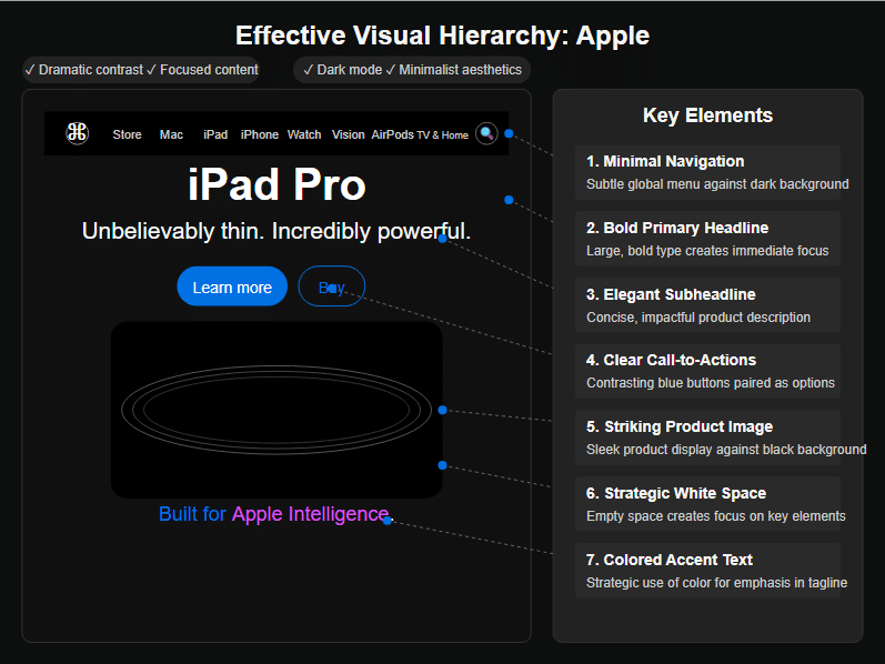
Apple’s website is predictably slick, and uses some excellent design elements.
Ling’s Cars:
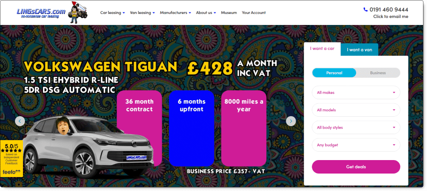
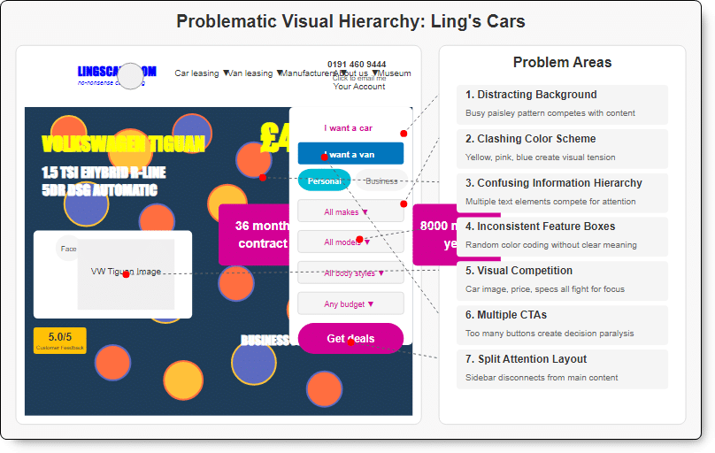
Ling’s Cars, on the other hand, breaks most if not all the rules, probably deliberately.
How to apply this.
In terms of appearance, do you prefer Apple or Ling? What would you do to declutter and improve?
Putting it all together: The Digital Optimisation Playbook.
You don’t need to be a web designer to improve your website’s functionality and appearance.
- The “One Goal Per Page” rule
- Progressive Disclosure: Reveal information only when needed (Hick’s Law in action)
- Break down information into digestible sections
- Reader-Friendly Formatting:
- Short paragraphs
- Bullet points
- Descriptive headings and subheadings
- High-contrast text
Why not take two quick and effective actions this week:
- Simplify your navigation
- Remove unnecessary elements
Digital pruning isn’t about removing vital content, it’s about making room for what matters most.
You might also consider signing up for one of our website reviews. At the time of publishing this blog post, we’re offering a limited number 100% for free.
Unique ideas for your business
The Demystifier puts practical ideas into your hands. You won't find them elsewhere. Original, actionable and insanely effective.