I just received an email from one of the UK’s main grocery outlets.
The email looked clean, fresh and inviting.
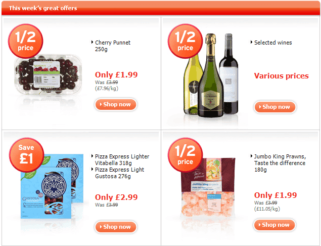
For each of the offers they had a picture of the product, the name, price, saving and original price.
Here’s what I found interesting.
I was more interested in the original price (shown with a line through it) than the saving.
Here’s where it goes wrong.
There are three bottles of wine, with a half price stamp on them. But how much do they cost?
I’d be more interested if a £20 bottle of wine were being sold at half price than a £4 bottle.
Note that this may be deliberate. There’s enough research proving that many people are more interested in the saving than the value of the deal. But it doesn’t work for me.
The other mistake is that I can’t actually read the original prices of the cherries, pizzas or prawns.
Good deals; poor execution.
Unique ideas for your business
The Demystifier puts practical ideas into your hands. You won't find them elsewhere. Original, actionable and insanely effective.


