There was a time when the numbers in your marketing dashboards and tools actually meant something.
They weren’t perfect.
There were disconnects: people switching between their phone, laptop and desktop. Cookies being removed. Clicking an ad on their phone, then buying on their laptop days later. The admin who bought placed the order after a team member saw the ad and researched the product.
But the data was meaningful and representative.
This is no longer true.
You may be tracking Google Ads conversions, organic search visibility, social metrics or sales after an email campaign.
But they’ve slowly drifted further from reality.
Ten years ago, if 90% of your conversions were recorded, today it might be 20% or lower.
And the same for almost every other metric you rely on.
The real problem, the one that’s causing the most harm, isn’t the gap.
The issue is that you never know how accurate or representative your data is.
Are you seeing 85% or 15% of what’s happening?
The dashboard looks the same either way.
Here’s how we got here.
What’s actually broken?
Blockers keep on blocking.
Apple’s Mail Privacy Protection now automatically opens every email, regardless of whether someone looks at it.
Considering that Apple Mail accounts for up to 58% at its peak (currently 45%) of global email opens, over half of your “opens” are potentially machine-generated noise.
Browsers also muddy the waters further.
Safari’s Intelligent Tracking Prevention, Firefox’s default tracker blocking, and Brave’s privacy-first design reduce data accuracy.
Cookie consent banners (you know the ones) mean every “Reject all” click is a tracking blackout.
And then there are ad blockers. These were once used by a small minority.
Today, many browsers offer them as standard, and installing a free ad blocker is as simple as it gets.
Journeys without a trace.
Someone researches on their phone over breakfast, explores other options for a few days, then buys from their laptop a few days after that.
To you, that’s two separate users.
And the clicker isn’t always the buyer, either.
The husband who saw the ad isn’t necessarily the wife who placed the order.
Add “dark social” to the pile: links shared in WhatsApp, Twitter (I won’t call it X), Slack, private messages and group chats, all arriving at your site with no referrer.
They all show as direct traffic.
The Direct and Unassigned buckets in GA4 quietly swallow more traffic every quarter. Interestingly, most of what’s in there isn’t direct at all.
The most uncomfortable category: modelled data dressed as measured data.
When users decline cookies, Analytics still counts them.
It uses machine learning to estimate what they probably did, based on the behaviour of users who did agree to the cookies.
Think about that.
Google say that these models can recover up to 70% of “lost” conversions.
So the reports look complete, solid, and precise.
But a significant proportion of the conversions in your dashboard are educated guesses dressed up as measurements. And Analytics doesn’t tell you which is which.
Google Ads does the same thing.
Meta does its own version.
Each platform reports back a number that quietly blends estimates with statistical inference, with no way to separate the two.
The combined effect turns dashboards into guesses of approximations.
The numbers still look and feel precise.
The connection to reality has loosened and worsened over time.
And then there’s AI.
So far, everything we’ve looked at is about traffic that arrives at your site.
The next problem is potentially bigger: traffic that never arrives at all.
AI search is changing everything.
A person asking ChatGPT “what’s the best way to fix X” will get a complete answer.
If you’re lucky, they may cite your blog post. But probably not.
So the tracking ends there.
No click. No visit. No referrer.
Nothing for any tracking system to capture.
Google’s AI Overviews are doing the same thing on the results page.
A query that may have produced ten blue links and a click now produces a generated summary and a satisfied user who doesn’t need to go any further.
Perplexity, Claude, and the other AI search tools are growing fast.
And voice assistants return one answer with no link to follow.
In the world of zero-click Searches, the traffic isn’t being mismeasured.
It’s being eliminated.
This isn’t a tracking problem you can fix with better tools or clever systems.
It’s a structural shift in how people find answers.
Your content might be effectively informing, persuading, and converting.
But doing it inside a mechanism you can’t see into.
None of it exists: the visit, the session, the conversion event, the attribution path.
When people talk about Google sending them less traffic, this is what they mean.
And the trend is only going one way.
AI search is gaining users, not losing them.
Why this hits small businesses hardest
Big advertisers don’t worry as much.
If you have 50,000 conversions a month, the dashboard is roughly right because modelled data and observed data match close enough.
Even if the details are wrong.
In large data samples, noise can average out.
The trends are readable, despite not being exact.
Small businesses, however, don’t have that luxury.
They get the worst of both worlds.
The same degraded tracking, but with volumes too small for any of the smoothing to work.
If your Google Ads campaign sees 200 conversions a month, but 30% of them are modelled, then this isn’t data.
It’s an opinion.
And with small businesses having smaller budgets, every dollar is a higher percentage of revenue being gambled.
And the risks of getting it wrong are far more painful.
Then there’s the testing idea.
Many small businesses don’t just use Google Ads to drive sales. They use it to test concepts.
Messaging. Audiences. Positioning. Whether a new product idea has the potential to do well.
If the conversion data feeding those tests is unreliable, the conclusions drawn from them are unreliable too.
In this scenario, you’re not just wasting ad spend.
You might be making the wrong business calls, and you won’t know until much later. If at all.
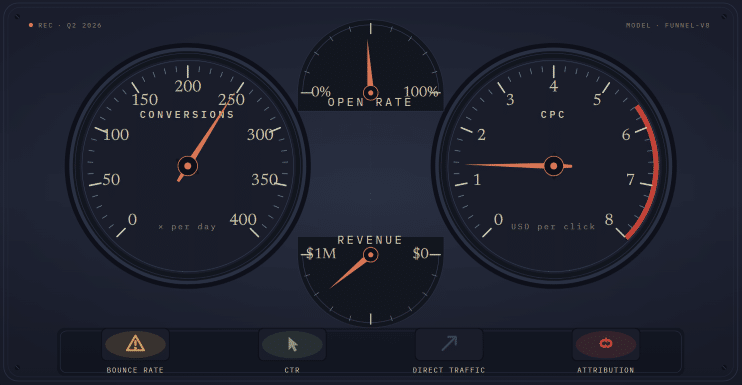
One gauge isn’t the answer
Imagine you’re driving your car and you look at the dashboard.


You’ll probably see a speedometer, rev counter, temperature gauge, fuel gauge, oil pressure, and a row of warning lights.
Looking at each individually will reveal nothing about what’s happening.
They must be read together and in context.
If your journey takes you up a long and steep mountain road?
You’d expect the temperature to rise, the revs to climb, and the miles per gallon to drop faster than usual.
That’s not a problem. That’s the engine working hard.
Coming back down the other side of the mountain, you’d expect higher revs as you use your gears to slow you down. Also, cooler temperatures, and very little fuel use.
Same dashboard, telling an entirely different reading.
Both are correct and accurate.
Marketing dashboards work the same way.
The Google Ads conversion number is one gauge.
Your bank balance is another.
So is “how did you hear about us” from new customers. So is the number of enquiries in your inbox.
And so is your gut sense, trained by years of running the business. Of knowing what works and what doesn’t.
Each of these are single indicators, with known biases and blind spots.
Each one tells you something the others can’t.
Individually, none can tell you what’s happening.
This is where it can fall apart
I’ve seen businesses who closed their Google Ads accounts, because the cost per click was too high. Or the recorded conversions too low.
One data point. Account closed.
The problem is that CPC on its own tells only the cost per click. Nothing more.
Ads with high CPCs but also high conversion rates are good.
Ads with high CPCs but low conversion rates; not so good.
Conversions are up this month, so the campaign must be working.
Bounce rates are high, so the page might be broken.
Open rates are down, so it must be the subject line.
Whatever tool or lens is being used shows a figure. The figure becomes the answer, and the decision is made.
Obviously, this is over-simplified, but even so, that has become the default for almost every type of business, large or small.
The closest or most compelling number wins.
And when you factor in this idea that almost every single number has lost its grip on reality, single-source decision-making is how good campaigns get killed, and bad ones get scaled.
Triangulation, in its real form, is the solution to this problem.
It means actively searching for the second source of data, and the third, and the fourth, before making a decision on what’s actually happening.
But there’s a dangerous and naive version of triangulation that’s almost as bad as not doing it at all.
The naive version goes like this.
You have several sources of information. You check them against each other.
Where they agree, you trust the consensus.
Where they disagree, you trust the source that seems most reliable.
Or you ignore the sources that don’t reinforce your story.
That isn’t triangulation. That’s voting.
Real triangulation is harder and more time-consuming.
It’s also vastly more useful.
It starts from the basic idea that every source is partial, every source has its own bias, and every source might be telling you something true that the others can’t see.
Here’s an almost-real example.
According to your Google Ads account, conversions and conversion rates are flat. Healthy.
And this is reflected nicely by last quarter’s data.
But your bank account says overall sales are down 15%.
The naive read is that the Google Ads numbers must be wrong. Tracking, shmacking, but the bank account doesn’t lie.
The naive read might be exactly backwards.
What if the ads are working perfectly, but something else is dragging sales down?
Maybe you have a new competitor? Or an existing competitor who’s lowered their prices?
Or maybe it’s a seasonal dip.
Without the Google Ads, your sales might be down 30%, instead of 15%.
In other words, the conversions in the dashboard aren’t lying.
They’re actually maintaining your sales, against a tide you can’t even see.
The right question isn’t which source is lying? It’s what’s actually happening, and what does each source tell me about a different piece of it?
A properly triangulated read pulls in more than two signals.
What does the account say?
What does the bank account say?
What are customers actually telling you when you ask “how did you hear about us”?
And are you asking?
What’s the lag between cause and effect, given that a brand campaign run today might surface in your inbox six weeks from now?
What are the competition doing?
And listen to your instincts – what do you feel may be going on, after everything you’ve seen in the past?
A good triangulated read might sound something like this.
“Conversions are flat in the account.
Enquiries have increased.
A competitor seems to have stopped their paid ads.
So perhaps the ads are working better than the Google Ads account suggests, and we should consider scaling them?”
That’s more or less the opposite of guessing.
That’s reading the gauges in context.
It takes more thought than reading a single number. But it produces a far more honest answer.
What is an educated guess?
An educated guess isn’t the same as a regular guess.
It’s a theory, based on disciplined facts and data.
Without the discipline, an “educated guess” is just permission to do what you were going to do anyway, with an inaccurate name attached.
With the discipline, it’s essentially a well-thought-out and researched hypothesis.
Here’s what makes a guess educated rather than reckless.
It’s informed by experience and evidence.
It’s not just pulled from the air.
It’s not a completely random guess.
Because you’re pattern-matching, and you know what the patterns are.
Vitally: you’re not forcing the case.
Write the hypothesis before you act.
“Changing the headline might lift enquiries by around 30%, as the current headline doesn’t address the buyer’s main concern.”
That’s a hypothesis. It’s specific, it’s testable, and it’s on paper.
You can come back to it in three weeks and check whether you were right, instead of quietly redefining success after the fact. We’ve all done that.
Success criteria are stated in real and actual terms.
Sales. Enquiries. Calls. Replies.
Things you can measure and count.
It isn’t “I’ll know it when I see it”.
That’s just flipping a coin with extra steps.
Setting a kill criteria and a deadline. Before you start.
What would have to happen for you to stop? And by when?
If you can’t answer that before you start, you’ll keep going forever, hoping the next week produces the data that works.
A pre-mortem.
Imagine it’s three months from now and the experiment failed.
What’s the most likely reason for this to happen?
Try and address that before the launch.
If this kills the idea before it costs you anything, then it’s doing its job.
Honest evaluation afterwards. Honest.
Including the willingness to admit that you were wrong.
This can be much harder than it sounds.
Why?
Because when things don’t turn out as expected, many people quietly move the goalposts. Allowing them to declare partial victory, even though reality says otherwise.
That’s not learning. That’s losing and pretending to win.
The crucial test is this:
Could you tell someone else what you did, what you expected to happen, and what actually happened?
If you can, it was an educated guess.
If you can’t, you were just guessing.
Bigger bets, bolder bets
Here’s the counterintuitive bit. In a world of unreliable data, you should be making bolder calls, not smaller ones.
Most marketing advice for small businesses goes the other way.
Test small. Iterate cautiously. Change one variable at a time. Wait for the numbers to come in.
In the good old days, when numbers were reliable, that made sense. Not any more.
Here’s why.
A small bet relies on detecting a small effect.
Changing a button colour. Swapping one word in a headline. Adjusting a bid by 10%.
The point of those tests is to try to produce a 2% or 3% improvement.
But realistically, a 3% improvement will be as good as invisible. Lost in the noise.
So either you’ll declare a success (on what was essentially a coin flip), or kill a win as it didn’t seem to make any difference.
Either way, you’ll have spent time and attention on something the data couldn’t resolve.
A bold bet is the opposite approach.
It’s more measurable, not less.
It’s an entirely different value proposition.
Or a genuinely different audience.
If a bet like that pays off, you’ll see it in the revenue, in the number of new enquiries, in the questions people ask on sales calls.
You won’t need to trawl through the data with a fine-toothed comb.
The signal you’re looking for will be loud enough to stand out from the noise.
Also note that bold doesn’t mean expensive.
A small business can test a very different value proposition on a single landing page. That’s all it needs.
The boldness is in the variation, not the budget.
The principle here is simple.
When the noise is high, you’ll need big, resounding signals to detect anything at all.
The whole idea of micro-optimisation? This was during a luxury of clean data.
Those days are gone.
Today, you need to optimise for changes that are large enough for you to notice them without a dashboard.
Because the dashboard is the thing you can no longer trust to spot the small differences.
But this isn’t a licence to be reckless.
Bold bets should still be hypothesis-based and driven, time-limited, and reversible.
Test the different landing page on a portion of your traffic, not all of it.
The bigger the bet, the more important the discipline from the educated guess section becomes, not less.
The patience paradox
Kill things faster. But not too quickly.
Both halves of this are correct, but they’re in tension.
Long tests can be pointless, as too much can change over time.
Short tests can be pointless, as they don’t produce enough statistically reliable data.
Both errors are common. Both are costly. Both can be deadly.
The key point is judging when you have enough to work with.
Which is a judgment, not a calculation.
The discipline is this.
Set the timeline before you start and write it down.
After that date, you make a decision.
Before that date, you don’t.
Otherwise, you’ll always find a reason to kill something on a bad week, or to keep going past the point where the answer was obvious two months ago.
Let the data rise to the top.
So pick one page
You can’t fix everything at once, so don’t try.
So start with one page on your website that matters.
It could be your home page. The main product or service page. The main landing page.
The page your business actually depends on.
Look at it properly, neutrally and objectively.
Try to see it and read it like someone who’s viewing it for the first time.
Don’t skim.
Do you think it answers the question your customers are asking when they arrive?
Or does it answer the question you think, wish or hope they’re asking?
Is what they should do next obvious? Or does the visitor have to work that out?
Do you think the page sends the right signals?
Then write down what you think the page is doing.
Followed by what you think it should be doing.
Two short and brutally honest paragraphs.
That’s where you can find the gold.
The dashboard isn’t going to start telling you the truth again. The data isn’t going to defragment.
AI search isn’t going to start sending the clicks back.
The genie doesn’t even know the bottle exists.
But the educated guess, properly made, was more honest than the dashboard.
We just stopped trusting it for a while because numbers were more appealing than speculation.
The numbers don’t look so convincing any more.
Unique ideas for your business
The Demystifier puts practical ideas into your hands. You won't find them elsewhere. Original, actionable and insanely effective.